Before We Begin
Hi, we're a digital marketing agency in Bournemouth, UK. We’ve created this guide from this post within the Webflow forum, credit to other contributors: @ToreSBentsen, @Nir, @Siton_Systems, @Cjh and @atrigol.
Please note: We have no affiliation with fullPage JS and advise you check out the licensing requirements as you may need to purchase a license depending on your intended usage. Full details can be found here.
Update: There's a newer version of FullPage JS (V4) now available, this guide only works with V3 and earlier - learn more about the change here. If you're interested in learning more about using V4 check out Álvaro Trigo Clones or the FullPage JS Website.
How to integrate fullPage JS on a Webflow site:
Before we explore how to allow scroll interactions, you’ll need to set up fullPage JS on your Webflow website. Copy and paste the below code snippet and paste it within your page settings under custom code.
If you’ve already added fullPage JS onto your website, click here to find out how to make it work with animations.
Tip: To avoid fullPage JS loading across your entire website, only paste this code into the relevant page setting custom code field.
Step 1:
Copy and paste this CSS code inside the page head tag of your page:
<style>
/*!
* fullPage 2.9.7
* https://github.com/alvarotrigo/fullPage.js
* MIT licensed
*
* Copyright (C) 2013 alvarotrigo.com - A project by Alvaro Trigo
*/
html.fp-enabled,
.fp-enabled body {
margin: 0;
padding: 0;
overflow:hidden;
/*Avoid flicker on slides transitions for mobile phones #336 */
-webkit-tap-highlight-color: rgba(0,0,0,0);
}
.fp-section {
position: relative;
-webkit-box-sizing: border-box; /* Safari<=5 Android<=3 */
-moz-box-sizing: border-box; /* <=28 */
box-sizing: border-box;
}
.fp-slide {
float: left;
}
.fp-slide, .fp-slidesContainer {
height: 100%;
display: block;
}
.fp-slides {
z-index:1;
height: 100%;
overflow: hidden;
position: relative;
-webkit-transition: all 0.3s ease-out; /* Safari<=6 Android<=4.3 */
transition: all 0.3s ease-out;
}
.fp-section.fp-table, .fp-slide.fp-table {
display: table;
table-layout:fixed;
width: 100%;
}
.fp-tableCell {
display: table-cell;
vertical-align: middle;
width: 100%;
height: 100%;
}
.fp-slidesContainer {
float: left;
position: relative;
}
.fp-controlArrow {
-webkit-user-select: none; /* webkit (safari, chrome) browsers */
-moz-user-select: none; /* mozilla browsers */
-khtml-user-select: none; /* webkit (konqueror) browsers */
-ms-user-select: none; /* IE10+ */
position: absolute;
z-index: 4;
top: 50%;
cursor: pointer;
width: 0;
height: 0;
border-style: solid;
margin-top: -38px;
-webkit-transform: translate3d(0,0,0);
-ms-transform: translate3d(0,0,0);
transform: translate3d(0,0,0);
}
.fp-controlArrow.fp-prev {
left: 15px;
width: 0;
border-width: 38.5px 34px 38.5px 0;
border-color: transparent #fff transparent transparent;
}
.fp-controlArrow.fp-next {
right: 15px;
border-width: 38.5px 0 38.5px 34px;
border-color: transparent transparent transparent #fff;
}
.fp-scrollable {
overflow: hidden;
position: relative;
}
.fp-scroller{
overflow: hidden;
}
.iScrollIndicator{
border: 0 !important;
}
.fp-notransition {
-webkit-transition: none !important;
transition: none !important;
}
#fp-nav {
position: fixed;
z-index: 100;
margin-top: -32px;
top: 50%;
opacity: 1;
-webkit-transform: translate3d(0,0,0);
}
#fp-nav.right {
right: 17px;
}
#fp-nav.left {
left: 17px;
}
.fp-slidesNav{
position: absolute;
z-index: 4;
opacity: 1;
-webkit-transform: translate3d(0,0,0);
-ms-transform: translate3d(0,0,0);
transform: translate3d(0,0,0);
left: 0 !important;
right: 0;
margin: 0 auto !important;
}
.fp-slidesNav.bottom {
bottom: 17px;
}
.fp-slidesNav.top {
top: 17px;
}
#fp-nav ul,
.fp-slidesNav ul {
margin: 0;
padding: 0;
}
#fp-nav ul li,
.fp-slidesNav ul li {
display: block;
width: 14px;
height: 13px;
margin: 7px;
position:relative;
}
.fp-slidesNav ul li {
display: inline-block;
}
#fp-nav ul li a,
.fp-slidesNav ul li a {
display: block;
position: relative;
z-index: 1;
width: 100%;
height: 100%;
cursor: pointer;
text-decoration: none;
}
#fp-nav ul li a.active span,
.fp-slidesNav ul li a.active span,
#fp-nav ul li:hover a.active span,
.fp-slidesNav ul li:hover a.active span{
height: 12px;
width: 12px;
margin: -6px 0 0 -6px;
border-radius: 100%;
}
#fp-nav ul li a span,
.fp-slidesNav ul li a span {
border-radius: 50%;
position: absolute;
z-index: 1;
height: 4px;
width: 4px;
border: 0;
background: #333;
left: 50%;
top: 50%;
margin: -2px 0 0 -2px;
-webkit-transition: all 0.1s ease-in-out;
-moz-transition: all 0.1s ease-in-out;
-o-transition: all 0.1s ease-in-out;
transition: all 0.1s ease-in-out;
}
#fp-nav ul li:hover a span,
.fp-slidesNav ul li:hover a span{
width: 10px;
height: 10px;
margin: -5px 0px 0px -5px;
}
#fp-nav ul li .fp-tooltip {
position: absolute;
top: -2px;
color: #fff;
font-size: 14px;
font-family: arial, helvetica, sans-serif;
white-space: nowrap;
max-width: 220px;
overflow: hidden;
display: block;
opacity: 0;
width: 0;
cursor: pointer;
}
#fp-nav ul li:hover .fp-tooltip,
#fp-nav.fp-show-active a.active + .fp-tooltip {
-webkit-transition: opacity 0.2s ease-in;
transition: opacity 0.2s ease-in;
width: auto;
opacity: 1;
}
#fp-nav ul li .fp-tooltip.right {
right: 20px;
}
#fp-nav ul li .fp-tooltip.left {
left: 20px;
}
.fp-auto-height.fp-section,
.fp-auto-height .fp-slide,
.fp-auto-height .fp-tableCell{
height: auto !important;
}
.fp-responsive .fp-auto-height-responsive.fp-section,
.fp-responsive .fp-auto-height-responsive .fp-slide,
.fp-responsive .fp-auto-height-responsive .fp-tableCell {
height: auto !important;
}
</style>
Step 2:
Add this code before the closing body tag of your page:
<script type="text/javascript" src="https://unpkg.com/fullpage.js@3.1.2/dist/fullpage.min.js"></script>
<script>
$(document).ready(function() {
$('#fullpage').fullpage();
});
</script>
Step 3:
Add full page ID and sections to your page:
You need to use a specific ID on the parent DIV and class names on child elements so the code above links in with your individual design. Here is the structure and class naming you'll need...
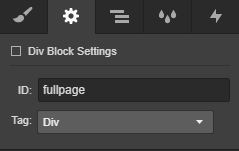
- Add a parent div and give it an ID of fullpage
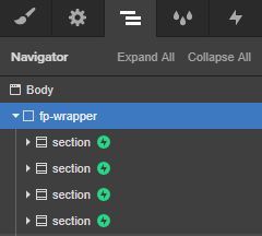
- Add your sections within this parent div and make sure they have a class name of section
- There's more customisation you can do, for in page linking etc, click here for more information

Assigning fullpage ID to fp-wrapper parent div

Section structure
Additional resources for adding the basics of fullPage JS to your site.
This initial setup is intended as a summary of integrating fullPage JS. You'll find lots of further support and documentation on the Webflow Forum, plus this video walk through by PixelGeek 😃
Updating the standard code to allow scroll interactions
Once you complete the above fullPage JS will be working on your site. However, you won't be able to integrate Webflow scroll interactions due to fullPage JS hacking the standard scrolling experience which would normally send triggers to initiate your awesome interactions!
Step 1:
Reinstating the scroll bar
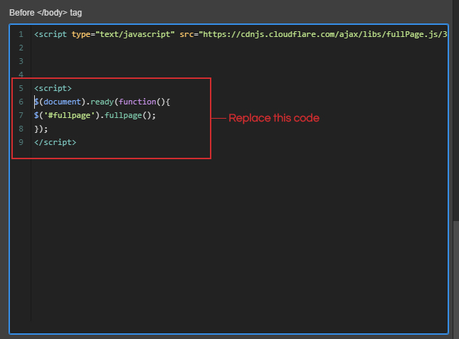
To overcome this, we need to insert some additional code to turn the browser scroll bar back on, and allow scroll interactions to operate as normal. This is the area of code we’re going to update:

Update the code (shown above) in the before </body tag of your page settings with the below code:
<script>
$(document).ready(function() {
$('#fullpage').fullpage({
scrollBar: true,
});
});
</script>
Tip: You can test that this worked by publishing and previewing your website. If it’s worked, the scroll bar will be visible again.
Step 2 (optional):
Hiding the scrollbar in Chrome
This step is optional and won’t impact scroll interactions, but we think it looks pretty great from a design perspective, so here’s how to hide the scroll bar on Chrome.
Add the following code inside the head tag of your page, making sure you have a class set on your Body element. (You may need to update .body below to match the class name you have given to your Body element).
<style>
.body {
/* These rules create an artificially confined space, so we get a scrollbar that we can hide. They are not directly involved in hiding the scrollbar. */
border: none;
padding: .5em;
white-space: pre-wrap;
height: 5em;
overflow-y: scroll;
}
.body::-webkit-scrollbar {
/* This is the magic bit for WebKit */
display: none;
}
</style>
Note: This will only hide the scroll bar on Chrome for desktop and mobile.
Adding Webflow Scroll Interactions:
Now you’re ready to implement your scroll interactions triggered by sections scrolling into view. Check out our cloneable project if you’re looking for some inspiration, or want a visual representation of how this would look on your site.
We recommend that you preview your animations on the live site as they may need a bit of extra tweaking than normal to work smoothly with the fullPage JS scroll easing. Here are a couple of extra tips that might help you crack fullPage JS interactions.
Try adding 50% offset to your scroll animations, this gives the section a bit more time to scroll into view.
Consider adding a slight delay at the beginning of your animations, again this just gives a bit more time for the section to fix into view. Not too long though, you don't want users to be waiting around for text and images to display!
Updates
April 25th 2022
FullPage JS has recently had a significant update to Version 4. We've updated the CDN being called in Step 2: Add this code before the closing body tag of your page to specify the version of FullPage JS to call, otherwise it loads Version 4 which causes this specific solution to break!
Make sure you are using https://unpkg.com/fullpage.js@3.1.2/dist/fullpage.min.js not the original https://unpkg.com/fullpage.js/dist/fullpage.min.js

